Outcome Mapping
Learning community


Outcome Mapping Practitioner Guide
Colour Coding Outcomes
Mapping outputs and outcomes using colour coding

Author: Roberto Borlini
Published: Wednesday 17 September 2014
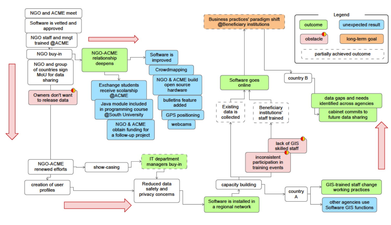
I normally include the harvesting of outcomes in the methodological design of my evaluations. However, when the time comes to analyse the substantiated information, I sometimes struggle to come up with meaningful visual maps of the outcomes of the programme. The reasons vary. In many cases projects have not been very successful and managed to produce only a small number of outcomes. In other cases, change processes initiated by the intervention are extremely long and the available outcomes are anecdotal and hard to substantiate. Finally, there are instances of projects that focus narrowly on completing activities without a clear strategic vision: outcomes are scattered over different areas and hardly relate to each other.
In these situations faced with the dilemma of producing maps with limited informative content or not producing maps at all, I use two simple tricks:
- I include both outputs and outcomes in the map, showing how tangible products contributed to change in behaviour
- I colour-code outputs and outcome for quick identification.
The resulting map is generally rich in content and visually appealing. Since outputs and outcomes can easily get confused on the map, I adopt different colours for outputs, intermediate outcomes and long-term outcomes, explaining their meaning in the accompanying legend. Colour coding creates an immediate visual impact on the audience.
Colour coding is also helpful when projects have numerous and well defined outcomes, interlinked with concrete outputs. Again, a strict separation of outputs and outcomes does not help to communicate the achievements of the project. In many cases, outputs lead to outcomes and, in turn, outcomes produce unexpected outputs. Representing only outcomes would leave out some important results of the project. Replication, multiplication effects, cross-fertilization are possible, but hard to represent in an outcome-only map. In these cases, I also represent graphically the entire chain of outputs-outcomes-outputs using different colours for outputs and outcomes. For this purpose, in my experience, it is not advisable to use more than four or five colours in a single map without risking confusing the reader.
If I feel that the number of results is overwhelming, I produce several maps, breaking down the project in smaller components, in which I can expand the analysis in greater detail. To this aim, DoView software (www.doview.com) is very helpful in creating a set of linked maps. In this case, colour coding should be consistent throughout the entire set of maps.
In a nutshell, producing outcome maps of development projects presents various challenges. Maps that include both outputs and outcomes are often richer in content than maps that merely show outcomes. When presenting both outputs and outcomes, colour coding is crucial to differentiate concrete products from changes in behaviour or relationships. However, too many colours confuse the audience. A map should not feature more than 4-5 colours, accompanied by a clarifying legend.
This nugget was applied in: Used in different evaluations
Related Practitioner Guide sections: